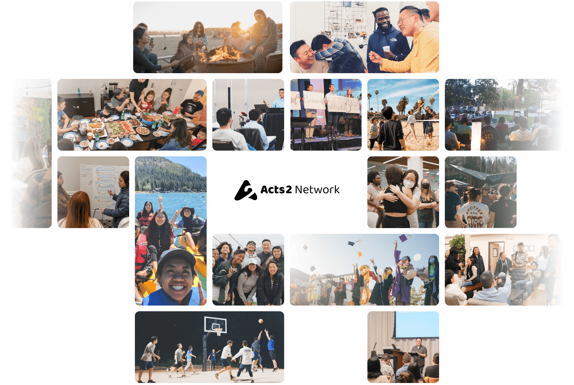
Our New Name
Gracepoint is now Acts2 Network
Looking back, it’s amazing how much we’ve changed over the years. Starting as a very homogeneous local church in Berkeley, we branched out to many cities and campuses and diversified our ministries. The scope of our ministries is such that our original local church’s name no longer adequately captures who we are.
"Acts2 Network" Captures How We’ve Changed
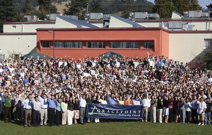
Gracepoint Inaugural Service - 2006
Over 15 years ago we caught the vision of "an Acts 2 church in every college town" and have now planted churches in 35 cities and birthed a number of parachurch ministries. We've grown from a simple local congregation to a complex network of ministries involving over 1,600+ covocational ministers nationwide, making our current structure feel a bit too snug.
Highlights Our Future Direction
As we've expanded across different cities and contexts, a lot of bandwidth started to go toward maintaining common strategy and standards. So, we're shifting away from a central leadership model to a locally-led, centrally-supported model. This will allow each ministry to adapt to its own context and will free up some of our veteran leaders to work on building better support and training systems for our ministry teams.
UC Merced

Pittsburgh

Paves the Way for Leadership Succession
We’ve had Pastor Ed and his wife, Kelly, at the helm for 30+ years now. As they reach their 60s this year we are restructuring to prepare for a future transition to the next generation of leaders.
The Acts 2 church will continue to be our vision. It’s what we fell in love with, lived out, planted in college towns, and want to see continue into the next generation. Over the years we've developed a certain "Way of Life" that enabled us to live out Acts 2. We’re hoping that our common commitment to this Way of Life will be the thread that continues to bind us together as we move into our next chapter.
As we embrace our new direction, "Gracepoint" will be phased out at both the network and local church levels. We’re thankful to God for how He led us thus far, and look forward to the vision of launching lifelong kingdom workers from every college town.